
Mobile UI/UX Design Trends That Will Make Your App Win The Trophy!
ByJasmin M
838 Views
The landscape of UI/UX is transforming continuously – new things are forming higher expectations for users time by time. Mobile App design is the most changing area in the mobile industry. We know that the UI design of an app is not just limited to its looks, but it’s a function of collective features and architecture successfully combined with UI/UX guidelines that organize, structure, and label an app’s content sustainably and accessibly. With these 10 winnings Mobile UI/UX Design trends, we have designed the most creative and versatile Mobile App Collection of our time.
Check whether your Mobile App is following the lead or missing out somewhere:
1. 3D UI Elements
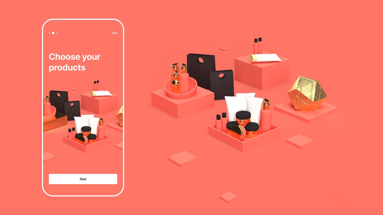
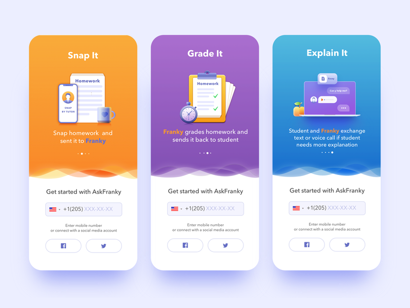
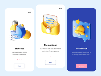
3D UI Elements are receiving great love..! 3D UI element integration in the UI will be the hottest trend of 2021. 3D is also being widely used in full-screen animations as the main key visuals.
Among the hot Mobile UI/UX design trends of the year, 3D graphics are rocketing on top of creative experiments. No doubt, the integration of various 3D graphics into mobile and web interfaces is quite a challenge that requires specific skills and an artistic eye to be crafted well. What’s more, it’s time-consuming. However, the benefits are worth considering:
- it is eye-catching and users will never pass by.
- The 3D renders often look photorealistic, which is a big advantage for user interface design: graphics of that kind may save the game in cases when the photo content you need is impossible to get or highly expensive.
- If you need to set futuristic vibes, nothing can help better.
2. Glassmorphism
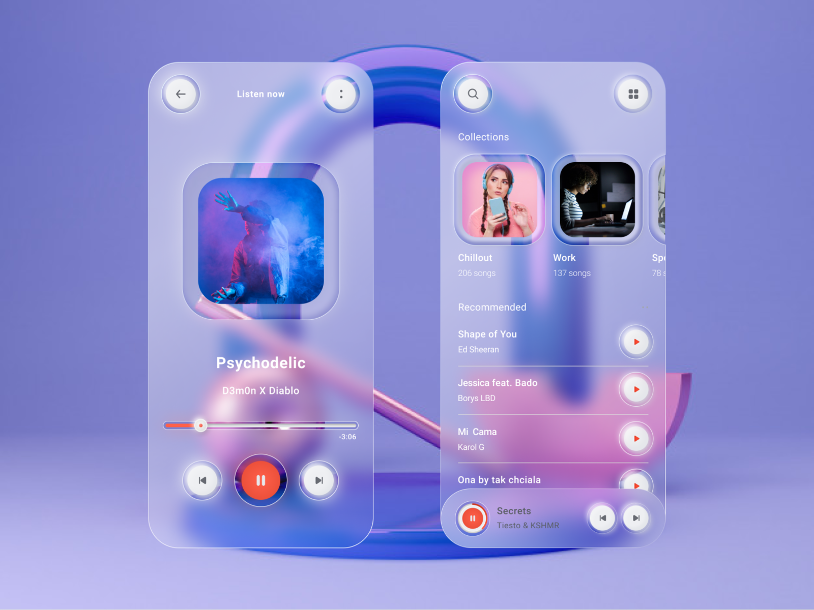
Like Neuomorphism last year, Glassmorphism is the new craze this year. It is the “through the glass” effect. The premise of this style isn’t new in itself…! It has been used in Windows VISTA and IOS 7 before. There is a new style on the block right now and it’s growing in popularity. While Neumorphism is imitating an extruded, plastic surface (but still looking like one layer), this new trend goes a bit more vertical. Its most defining characteristics are:
- Transparency (frosted-glass effect using a Background Blur)
- Multi-layered approach with objects floating in space
- Vivid colors to highlight blurred transparency
- A subtle, light border on the translucent objects.
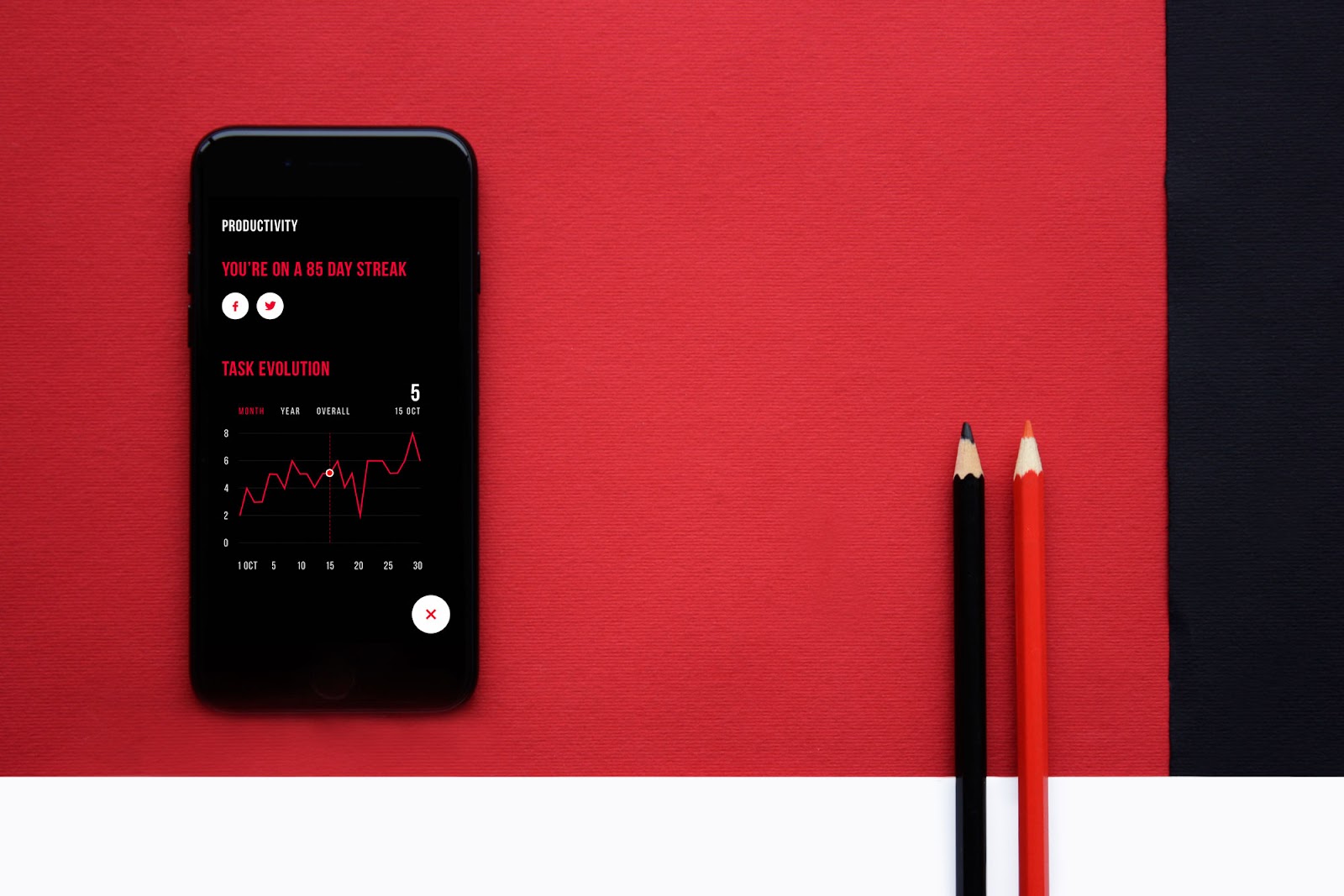
3. Dark Mode
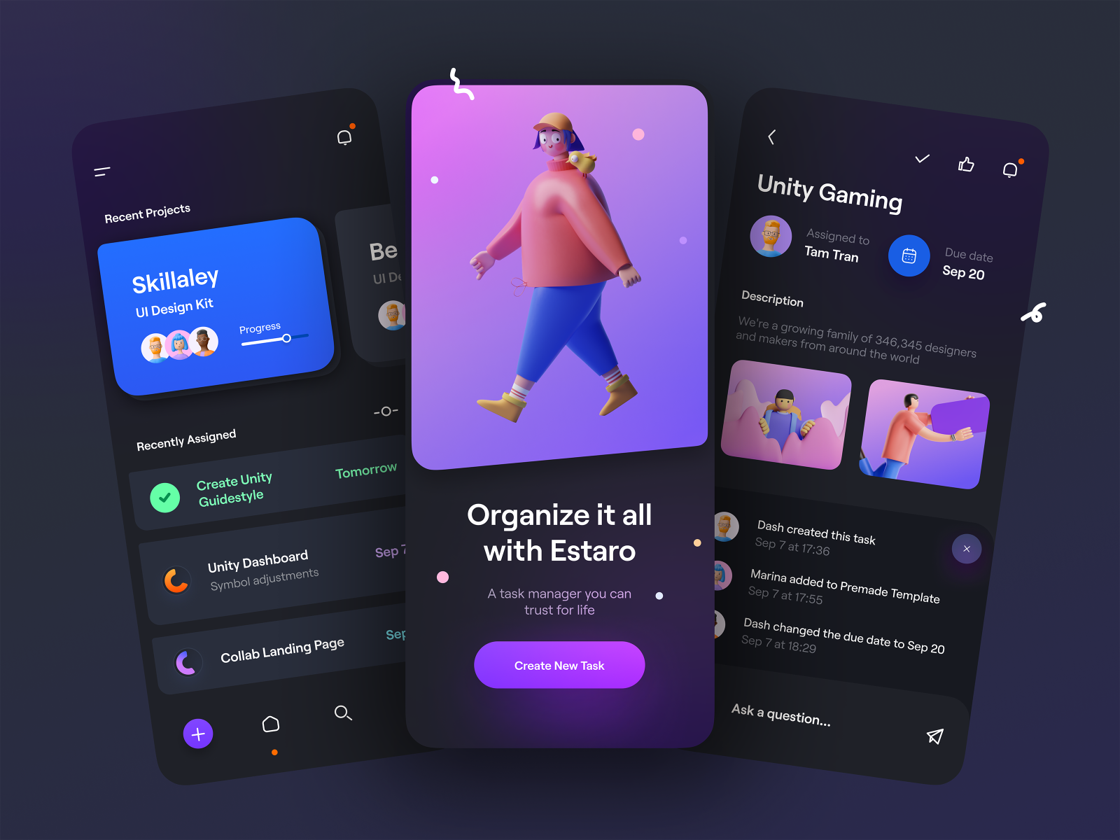
Dark mode will again be one of the hottest Mobile UI/UX Design trends of 2021. Big Brands like Facebook, Instagram, Apple, and Android offer Dark Mode as alternative themes in their Products. It looks modern, allows design elements to pop, and reduces eye strain.
Dark UI designs are seen far and wide, from mobile screens to massive TVs. A dark theme can express power, luxury, sophistication, and elegance. However, designing for dark UIs presents multiple challenges and won’t meet expectations if implemented poorly. Before diving into the “dark side,” designers should look before they leap.
Digital products with dark UIs—associated with power, elegance, and mystery—are a formidable trend. While it’s often said that dark mode can reduce eye strain, there is no evidence that this is true. Under certain circumstances, it’s also supposed to save battery life. Still, more often than not, dark themes are an aesthetic choice.
4. Colorless UI
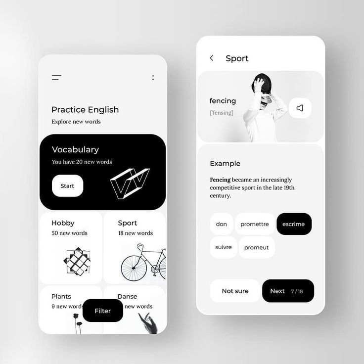
The use of vivid and vibrant colors can be seen a lot in the UI in 2021. Colorless UO with thin lines and black and white(or subtle color) illustrations are quite popular too. The combination of black and white offers the maximum contrast possible because they come from opposite ends of the color spectrum.
Black and white websites are classical, strong, and powerful, but most of all this color combination is the epitome of elegance. Black and white is a timeless combination, it always works and never goes out of fashion.
5. Bauhaus Style

The style of Bauhaus is commonly characterized as a combination of the arts and crafts movement with modernism. Bauhaus’ designs feature little ornamentation and a focus on balanced forms and abstract shapes.
Here’s what stood out for the field of UX:
- Simplicity — the constant need for reinterpretation, renegotiation, and defense of this foundational principle of accessible design.
- Gesamtkunstwerk — making responsible use of our growing ability to design for all senses across many surfaces in digital product creation.
- Staying connected to practice — finding ways of staying engaged in the creative process across levels and functions, e.g. via design sprints
- Creative collaboration — deep empathy and partnership not just with our users but also with our co-creators, the engineers, managers, marketers
- Personal bonds — the importance of making room for playful interactions and forming lasting bonds beyond ‘professional networking’
- Social good — not losing sight of our motivation to create products that benefit the people who use them and society at large.
6. Colors on White Surface
Colors are the most important visual elements that can highlight your content and brand’s style. But it should help the UI elements and surface to be easily distinguished from one another. There are 3 important things about color that you should know: Hue, Value, and saturation. Hue is the color in its natural state. For example blue, green-yellow, yellow, red, etc. Without any variation of light and darkness.
In UI (User Interface) the value plays an important role because when we use it well, we can get good contrast and also different surfaces in our interface. Saturation is the intensity of the color, when we saturate a color, we have a more intense and vivid color. When we desaturate color, we have a dull color, an example of this is when we completely desaturate a color, we have a gray color.
7. Animated illustration in UI
UI Designers are incorporating more and more animated illustrations these days in UI. Animations captivate a user’s emotions, help them understand more complex procedures and concepts, and reflect a brand’s personality. Digital illustrations applied on websites, landing pages, mobile screens, and emails present the booming trend this year.
Custom graphic design is also widely used for promo and explainer videos. More and more often, we find animated illustrations in web and mobile interfaces: images in motion catch our attention and add life to the pages. The benefits of this approach are well-checked: digital artworks support the original and stylish look of the product, quickly transfer the needed message, and add emotional appeal.
8. Aesthetic Minimalism
The minimalist aesthetic focuses on the visual aspect of minimalism and expresses a clean and fresh style in design. You don’t always need a fancy UI, or “wow effects” for your product to look astounding, there’s nothing more aesthetically pleasing than a simple, minimal, and readable UI.
The main features of minimalism often mentioned by designers include:
- Simplicity
- Clarity
- Expressive visual hierarchy
- High attention to proportions and composition
- Functionality of every element
- Big amount of spare space
- High attention ratio to core details
- Typography as a significant design element
- Eliminating non-functional decorative elements
9. Big/Bold Typography
Big/Bold and chaotic typography was hot last year and it will continue to grow in 2021. Some websites/apps are entirely based on typography and result in very interesting. Regardless of how or if the other design techniques are used, bold type is almost always present. It’s no surprise that big, bold lettering is often used in minimalist designs. It’s the perfect contrast to the stark nature of the design provides visual interest and helps get users into the content. But what makes typography bold? It can be several things; the key to finding the perfect level of boldness is often to look at how much lettering contrasts with the rest of the design. Bold type is lettering that stands out from its surroundings and demands to be read. But it has to be an integral (and integrated) part of the overall aesthetic. Bold typography should have purpose and meaning.
10. Immersive Interface

UX/UI design should always harness the best of technology, that’s why it’s essential to use the latest immersive interface design. By integrating functions and scenes into the design, users can generate more experience in the process of using the product.
Conclusion:
Today’s mobile app design trends are all about focusing on the customer and finding the best user-oriented solution. And we believe that when you put your customer at the center of your design strategy, you bring confidence in your product and yourself.
Was this article helpful?
YesNo


