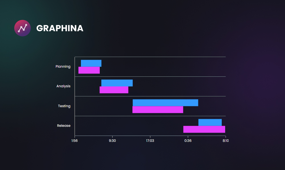
Timeline Chart WordPress Data Visualization With Graphina
676 Views
WordPress is one of the most popular content management systems in use today, with more than 60 million websites powered by it. This robustness makes it a prime target for data visualization projects. In this blog post, we’ll take a look at how to create a timeline chart visualization of WordPress data using the Graphina library.
But firstly, we will take at a look the details of what is timeline chart. And what are the benefits of using a timeline chart?
What is a Timeline Chart?
Timelines are primarily used to communicate time-related information, either for analysis or for presenting a story or view of history. A Timeline is a type of data visualization that shows when events occur or are to occur. It showcases viewers’ patterns appearing over any selected period or how events are distributed during that time. Other forms of data visualization can be combined with a Timeline to show how quantitative data changes over time.
Why Do You Need it?
To have a better view of all the tasks of a project in chronological order, we need a timeline. In a timeline, every task has its priority, as well as when it gets completed and how long it should continue. This allows us to plan out which task to perform next.
What Kind of Data Can Be Optimized Properly With a Timeline Chart?
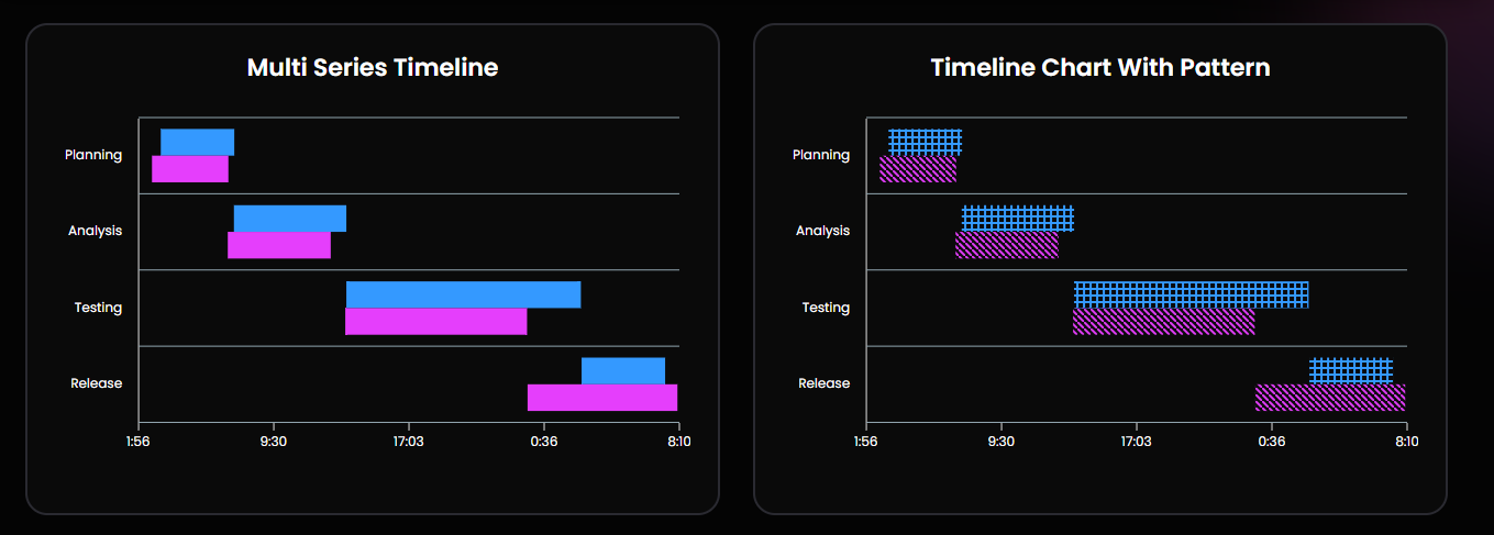
A timeline chart is a graphical representation of a sequence of events, used to communicate time-related information. A timeline can be scale-based, allowing you to see the time intervals between events, or it can be combined with other forms of data visualization to show how quantitative data changes over time.
Graphina – Best Data Visualization Plugin
Steps to use Timeline chart with one of the Best Data Visualization Plugin – Graphina
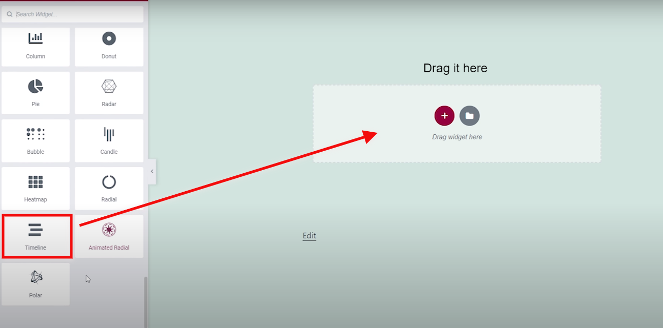
Step 1:-
First of all, open the Graphina and drag out the Timeline chart.
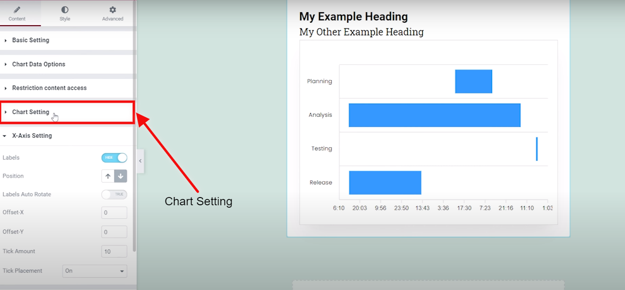
Step 2:-
After dragging out the timeline chart, go to the chart settings.
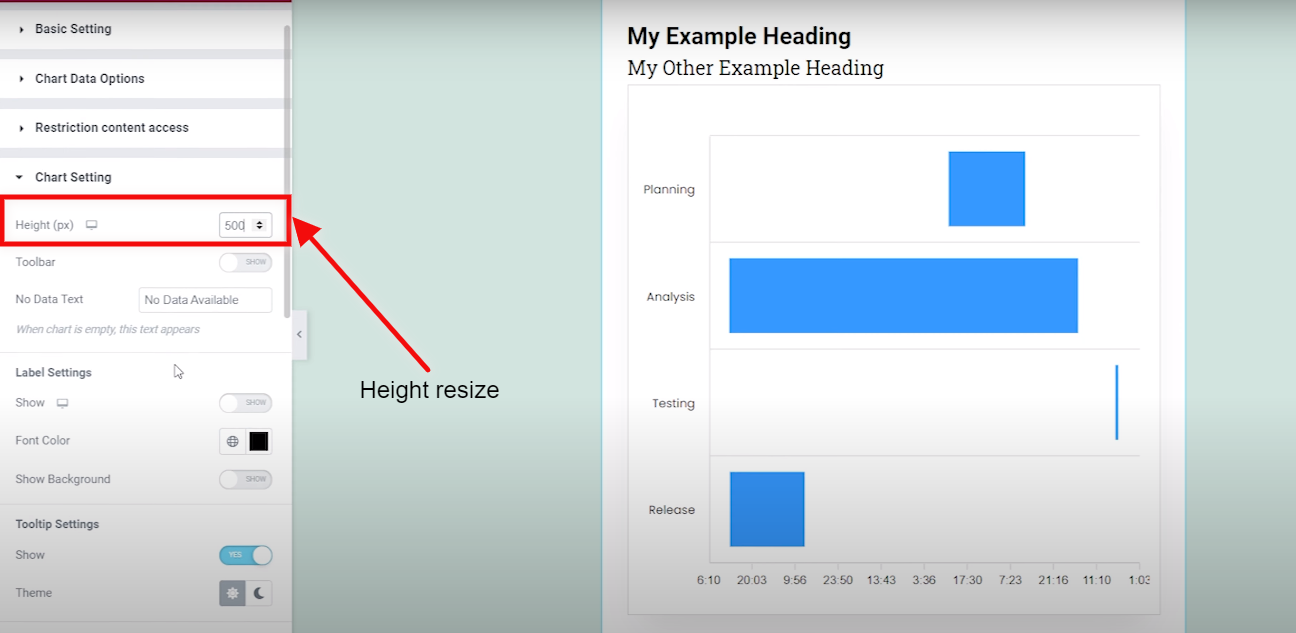
Step 3:-
You can resize your card by changing the height.
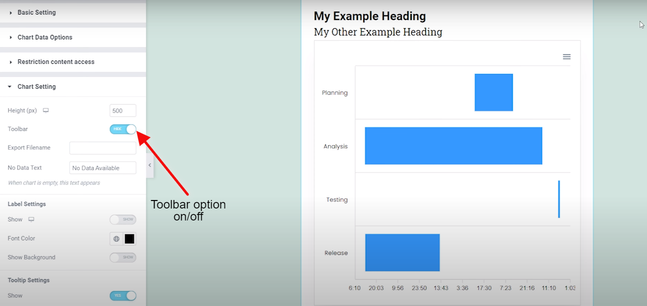
Step 4:-
You are also having an option on the toolbar, that you can turn on and off at period.
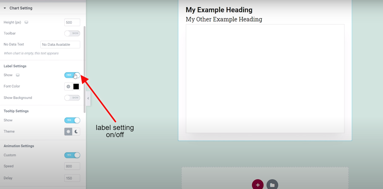
Step 5:-
An option is also available for label settings, which you can also turn on and off at a specific time.
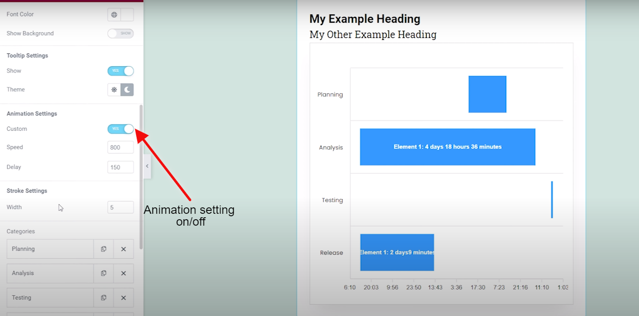
Step 6:-
Animation option where you can turn it on and off and bring your taste to the card.
That’s it for the Timeline chart. Want to use Graphina more? Click – Here for one of the best data visualization plugin – Graphina.
One reminder Graphina comes with
- 1000+ Variations
- 5+ Unique Charts
- 100+ Customization Options
Few benefits to gain from Graphina
- Data-Driven
- User-Friendly
- No coding Knowledge Required
- Multiple Google Fonts
- Real-time Customization
Was this article helpful?
YesNo


