
3 Impressive Admin Templates & Trending UI kits to Exponentially Boost your Productivity
451 Views
“Creativity is to think more efficiently”
We are living in a competitive era, where entrepreneurs not only crave creativity but also an efficient implementing strategy. If an individual has a certain extraordinary skill set, to frame alluring ideas, thoughts, and strategies but somehow fails to implement them precisely then there’s no achievement to cherish.
Gone are those days when the back end was not considered a priority. Today, almost every organization makes sure that their back-end is smoothly functioning, easy to handle, comprehensive, and result-oriented.
If you’re struggling to make your Admin Dashboard efficient, then I assure you that you’re at the right place to get your query resolved and acquire impressive Admin Templates & Dashboard UI Kits.
So, let’s start by gaining some insight into the Admin Dashboard.
About Admin Dashboard
In layman’s language, a dashboard is an interface that appears in your respective application to display highly relevant information.
The admin dashboard is a set of web pages, developed with HTML CSS JavaScript, or any other libraries. They are primarily built to create a comprehensive user interface for the back-end optimization of a web application. Generally, a dashboard provides the user with an overall overview constituting shortcuts for common management tasks, updates for broad projects, functions and controls, and essential data.
Let’s take an instance.
Suppose, you’re an interviewer. How much time will you take to consider the CV of an interviewee?
It’s a fact that an average of 6 seconds is spent on the CV, and in those couple of seconds, an application has to grab the attention.
A dashboard should only show relevant information. Users always expect to see information about the current status as well as any urgent information, warnings, or alerts at the very first go.
Quick Fact- We must always design our dashboards in such a way that it helps the user to be more efficient and time-saving.
It can be tricky to decide the relevant information which is to be displayed on the dashboard. A Thumb rule is there to help you with, Always start with a high-level overview, and provide easy paths for your users to increase the level of comprehension.
For greater explanation, we have covered the most common dashboard components for you.
Most Common Dashboard Components
Before going for an Admin templates we must prioritize our needs and requirements. For a different design or template, there exists a different need or requirement.
The top questions which you must prefer are, what are your priorities? What’s your product type? In which category of the product falls? And what do you expect in the admin template?
The following are the aspects that you must prefer before selecting an ideal template.
Design
It is considered to be the most important factor as it should be superior quality-oriented, user-friendly, organized, attractive, unique, and professional-looking.
Functionalities
A better admin template requires a lot of web components like graphs, charts, pages, plugins, and many more functionalities. You should be able to perform all the requirements present in your checklist from your template. The functionalities must be exceptional.
Quality
The quality of the admin template is measured by the quality of the design and the code.
It depends on the following parameters-
Its readability, properly commented, and indented, proper naming, correctness of the code, error-free usability, ease to customize, efficiency, reduced redundancy, and optimization to the fast loading.
Reliability
Aspect can only be measured by the users’ feedback and their ratings. So a user must take it to the website or the marketplace and they should be able to evaluate the documentation of the template.
Version
With every developing version, new features are added to the template. These new features help the user to be more interactive, efficient, and target-driven. A desirable template must provide the latest version of all the plugins and add-ons to the framework.
Now, let’s move to the various types of dashboard design.
Types of Dashboard design
There are three main types of dashboard designs when we consider business intelligence.
Operational Dashboards
To configure the current status in your app and to optimize the result, operational dashboards come in very handy. When we work on a project that’s time-bound and contains critical information about the clients then it’s the best choice.
They turn out to be a great interface as they provide an instant status check at a glance and results. You must structure your data in such a way that as soon as you open your dashboard you can see the critical information at the topmost left corner.
Analytical dashboards
They are used to present high data sets and always reflect the comparison between previous performance and the current one. They should contain key account data at the front and center and minimum graphical elements.
Strategic Dashboards
They are used to indicate the performance of key performance indicators (KPIs). They reflect the performance against the strategic goals.
Now, let’s quickly move to the essential UI kits offered by us for some custom dashboard designs.
UI Kits for Custom Dashboard Design
Iqonic Design helps you to create custom dashboards in a prototype by offering multiple functionalities such as line graphs, bar charts, bubble charts, gauges, maps, XY charts, and more to create a familiar-looking dashboard.
For Salesforce UI Dashboard Design
For the Salesforce user interface dashboard, we provide numerous UI elements, patterns, and guides that aim to deliver business apps with excellent and consistent design.
The algorithm is so simple that from buttons to navigation to cards to notifications, you can easily use the UI kit and create dashboards.
For SAP Fiori Dashboard Design
To create the SAP applications, SAP’s Fiori is the design provided by us. It uses modern principles to deliver a good-looking and efficient SAP application.
For Dashboard Design in Oracle Alta UI
Alta UI is Oracle’s design system for applications in its cloud service as well as for applications in Oracle Fusion. Alta UI aims to simplify and improve the user experience by reducing elements and using a cleaner, more modern design and reduced chrome for a better user interface.
It also focuses on multi-device compatibility, simple new icons, and a mobile-first approach with responsive page widths and large touch targets.
Now, let’s move to the best practices for designing a dashboard.
Best Practices for Dashboard Designing
Analyze what your users need from the Dashboard
What are the expectations of our clients from our dashboard? Finalize the top 5 takeaways from the dashboard for your clients then apply the content in the F and Z reading pattern, which will structure your page accordingly.
It will be more convenient if the dashboard does its Job while being on the same page. Never overwhelm your audience by giving too much information on a single page; this can turn into clumsiness.
Group all the essential information in a presentable way, by this It will provide better engagement plus balance matrices.
Leading with Key Data
We love the panels that cut out the bunk and run with big, bold numbers. A panel like this conveys confidence and determination. The style is on trend with a clean modern design.
Such a design contains white space and bold, clear data to take away. Presenting data like this helps the user see what’s important right away and does what a dashboard should always do: save the user time.
Multiple Views to Keep Things at Ease
We like panels that use different views to keep the main view as simple as possible. Take a look at this dashboard for a restaurant management web application.
See how the user can filter data by date, switch between restaurants, and access information about reservations, payments made, employees, shifts, and outside suppliers while keeping a clean and simple look at the screen.
List of 3 Impressive Admin Templates & Dashboard UI Kits
1. PosDash Lite – Free HTML Inventory Admin Template

POSDash Lite is an amazingly designed Free HTML Inventory Admin Template. The clean and minimal design, a free HTML template for the inventory system puts your business ahead and manages operations efficiently. With beautifully crafted inner pages and sections with widgets, animation, UI elements, and components, this stunning POSDash Lite tops the list of free Admin templates.
POSDash Lite – free inventory management admin template includes pages like Maintenance page, Error 404 and 500 pages, Invoice page, Pricing page, Sign in and Sign Up pages, etc. POSDash Lite – free HTML inventory admin template is built to provide the ultimate user experience and it is tested to give a seamless experience and faster development.
The premium version of this smart, free HTML inventory admin template is available as POSDash – VueJS HTML Inventory Admin Template comes with a wider range of features and functionalities to cover any warehousing or inventory management business and services.
2. Datum Lite – Free CRM HTML Admin Dashboard Template

The free CRM Bootstrap admin template is designed to monitor customer needs and behavior towards the product when the marketing campaign is aligned with the company’s goal, preferences, and touchpoints. It is a free, functional free CRM admin template for businesses, marketers, managers, agencies, and freelancers.
3. Hope UI Laravel – Open Source Laravel Admin Panel
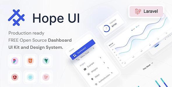
Hope UI is a straightforward, open-source administration panel. This free Laravel dashboard template contains dedicated pages, UI elements, utilities, widgets, etc. It contains a definitive design system for startups or companies as well as freelancers to generate sales, profits, and costs – and to create a sales monitoring system for a defined period.
Conclusion
So, that’s all from our side. Hope you enjoyed this informative blog on Admin Templates and dashboard UI Kits. With the rapid increase of online ventures, competition is increasing fiercely too. If you want to stand out from the other enterprises, Make sure you establish yourself 360 degrees strong.
Not only focus on building your front-end comprehensively, but to make the optimum utilization of resources you have to make the back-end strong.
Iqonic Design provides the best Admin Templates & Dashboard UI Kits to make your interface increase your profitability exponentially.
Feel free to contact us, please share your thoughts on this blog in the comments section below. Thank you for taking the time to read our work, and if you liked it, please share it with your friends and family.
Was this article helpful?
YesNo


