Radar Chart Or Spider Chart In WordPress Data Visualisation With Graphina
1897 Views
Graphina is the easiest data visualization plugin that offers web developers to easily create WordPress charts and graphs for their website, which makes data presentation more user-friendly and attractive.
This WordPress charts and graphs plugin comes up with a wide range of charts and graphs that can be customized without touching a single line of code and will fit the requirements of your project easily. With Graphina’s easy-to-use interface, visual presentation of your data can be done in minimal time.
Graphina is a WordPress plugin that lets you create most of the most appealing charts and graphs. With over 1000 variations, 15+ chart styles and 100+ customizing options. So now easily gain the power for creating the perfect chart for your website.
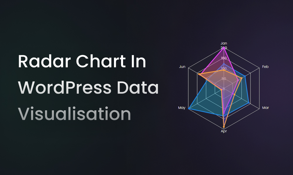
Out of those 15+ styles in chart and graphs, there is a chart called Radar chart or spider chart. It mostly looks like a spider web.
What is a Radar Chart?
A radar chart helps in creating and comparing data groups with definite features. By utilizing this chart we can compare various groups and items by putting them at the same point. It can make you compare multiple parameters using a radar chart. It gathers items on the central point of the chart and then utilizes transparent shades and patterns for showcasing contrast to the readers.
This chart was created by Georg Mayr in the late 1870s it has been changed briefly. These days Radar charts are mostly utilized for the purpose of comparing, analyzing, and decision making.
Elements of Radar Chart
Centre Point = Core and center of the this chart from different axes appear.
Axis = Each axis shows a variable in the chart and is given a specific name and multiple values.
Grids = Due to the axis linked in a spider chart, it does the division of the entire chart that assists in representing information accurately.
Values = Graph is drawn, representing multiple values on each axis and plotting the chart for every entry.
PROS:
- Comparing multiple entities can be easy with this tool.
- Multiple variables can also be compared with a chart.
- Simpler to understand the column diagram too.
- Different entities can be known using color-coding.
CONS:
- Lots of variables to compare then even Radar charts will be choked.
- Users find it hard to come up with ideal data for different sets of variables.
- No trade-off decisions or comparing distinctive variables can show negative results.
Business Use:
Employs appraisals and review – Supervisors often use this chart while providing feedback to their employees because these charts allow easy comparison of a single employee to the average ratio of the whole team.
Product comparison – Businesses tend to use more radar charts for their multiple comparisons because it allows them for comparing two or more products in a range.
Store location management – This chart will assist you in comparing the newly opened store and the well-established store. So you can analyze both stores and can also correct the lack ness in its performance.
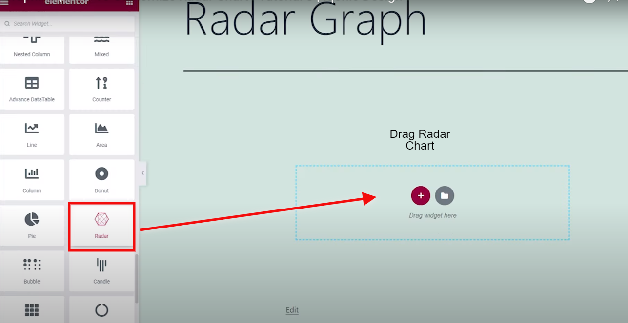
How to build a Radar chart with Graphina?
Firstly, Open the Graphina and Drag your Radar chart or Spider chart to your page.
And then go to chart settings, where you will see the multiple options for customizing the chart.
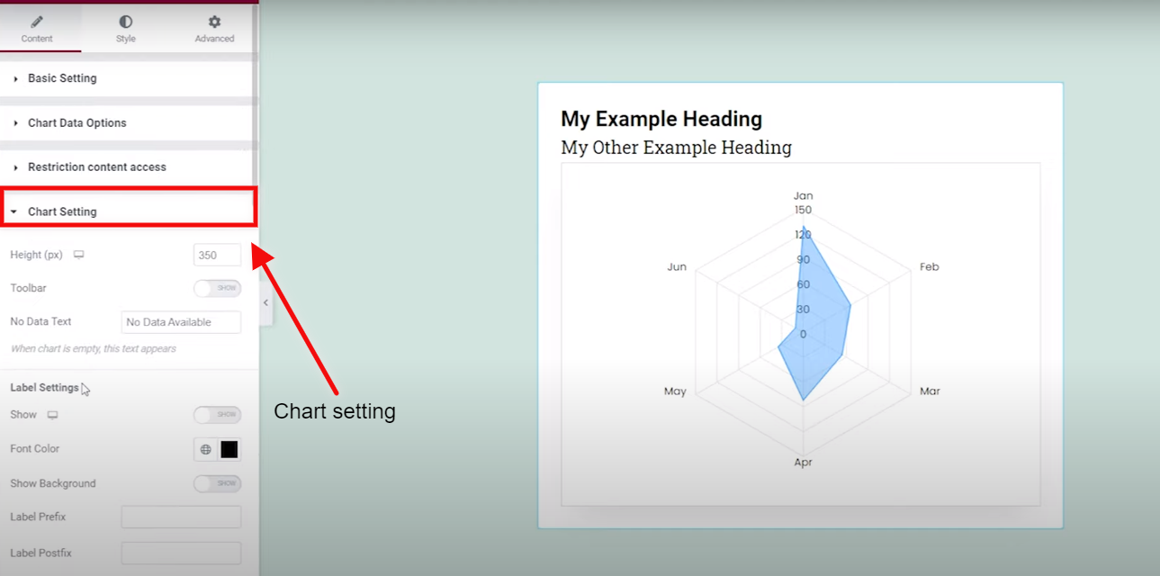
You can reset your card by changing the values given in the Height.
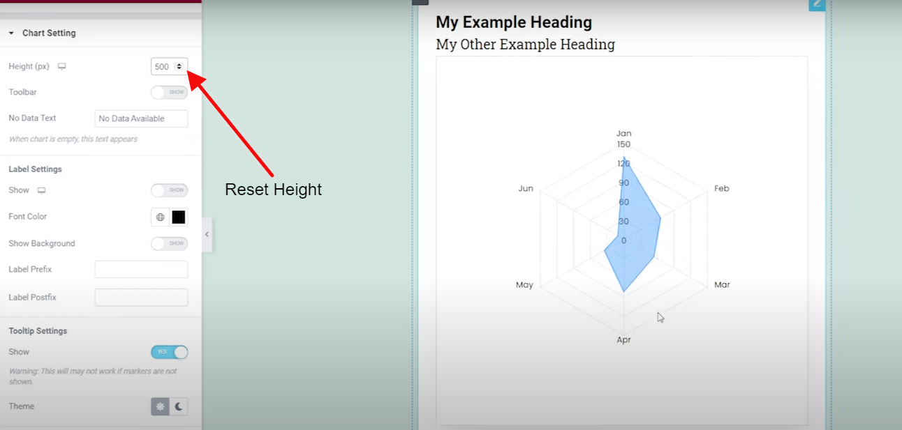
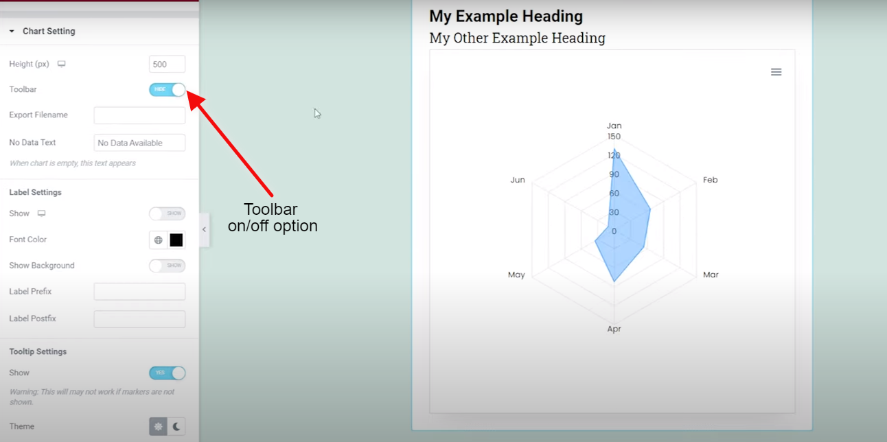
Beneath is an option the toolbar, which you can turn on and off as per your requirement.
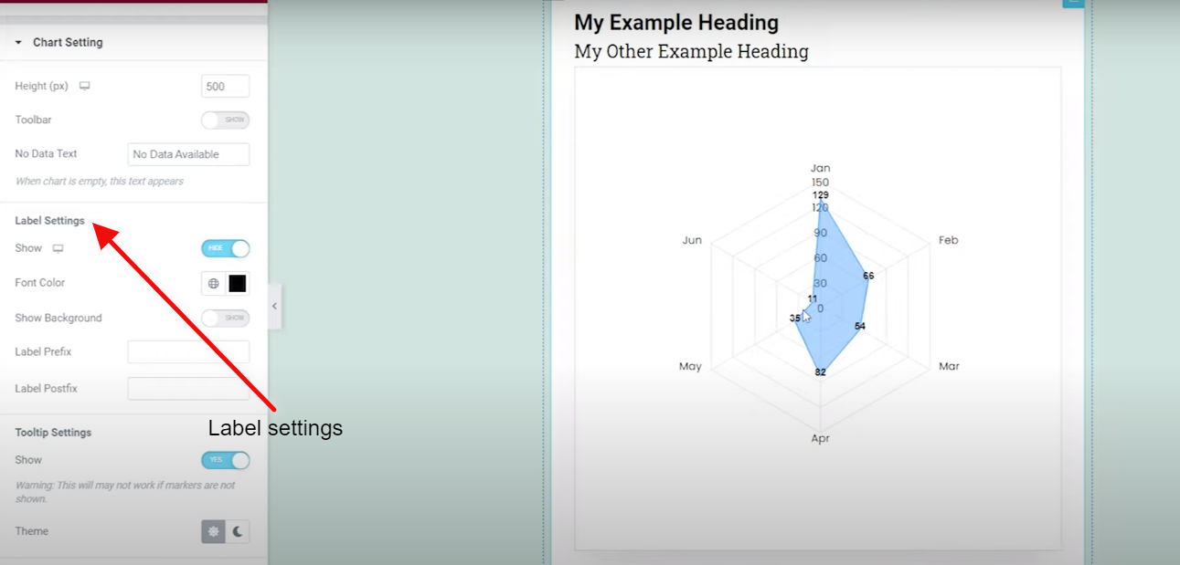
In label settings, you can add it whenever you require one.
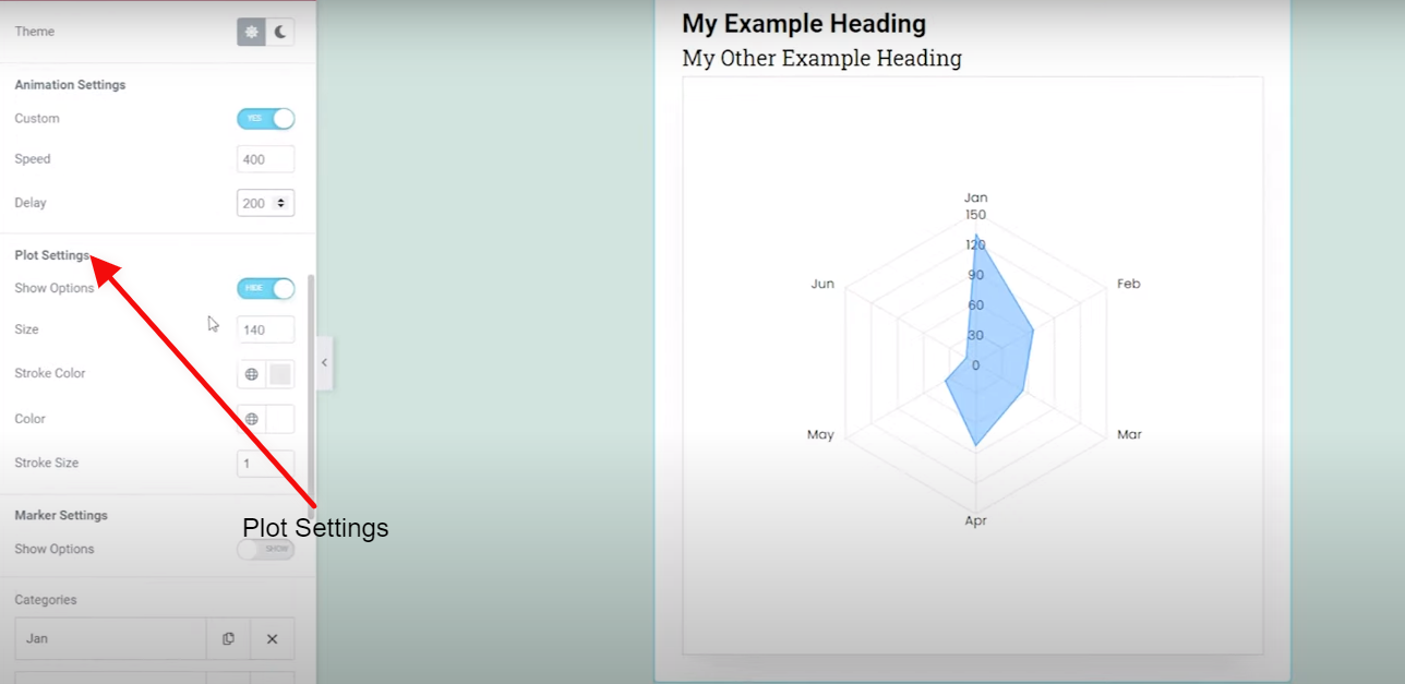
Going further, you are also having an option of plot settings.
In plot settings, you can change the plot color by clicking on Color Picker
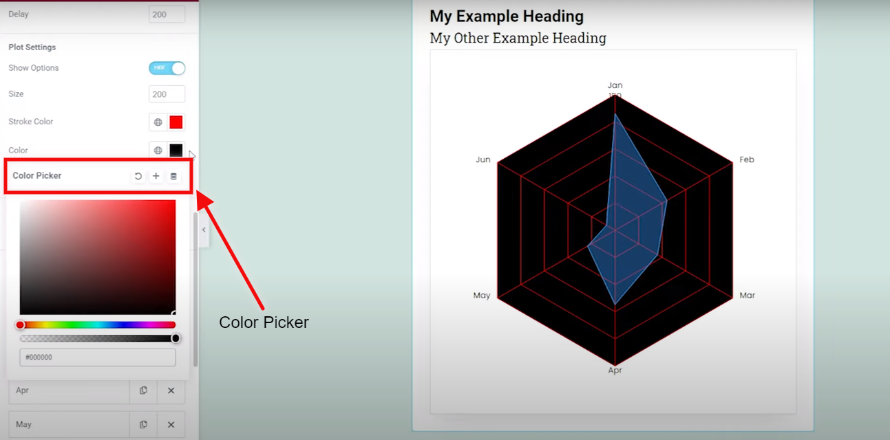
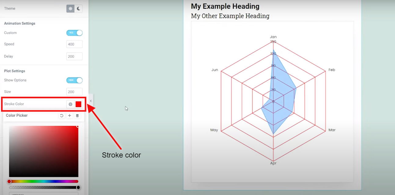
You can change the stroke color by clicking on the Stroke Color and changing the color as per your requirement.
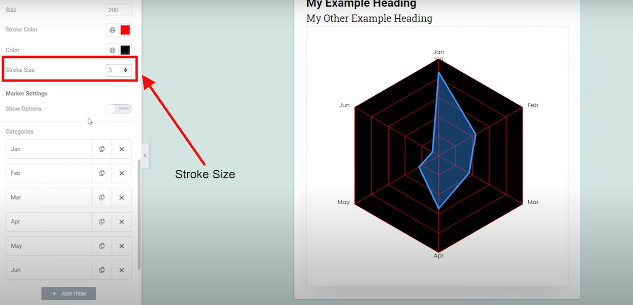
Change the stroke size by clicking on the Stroke Size.
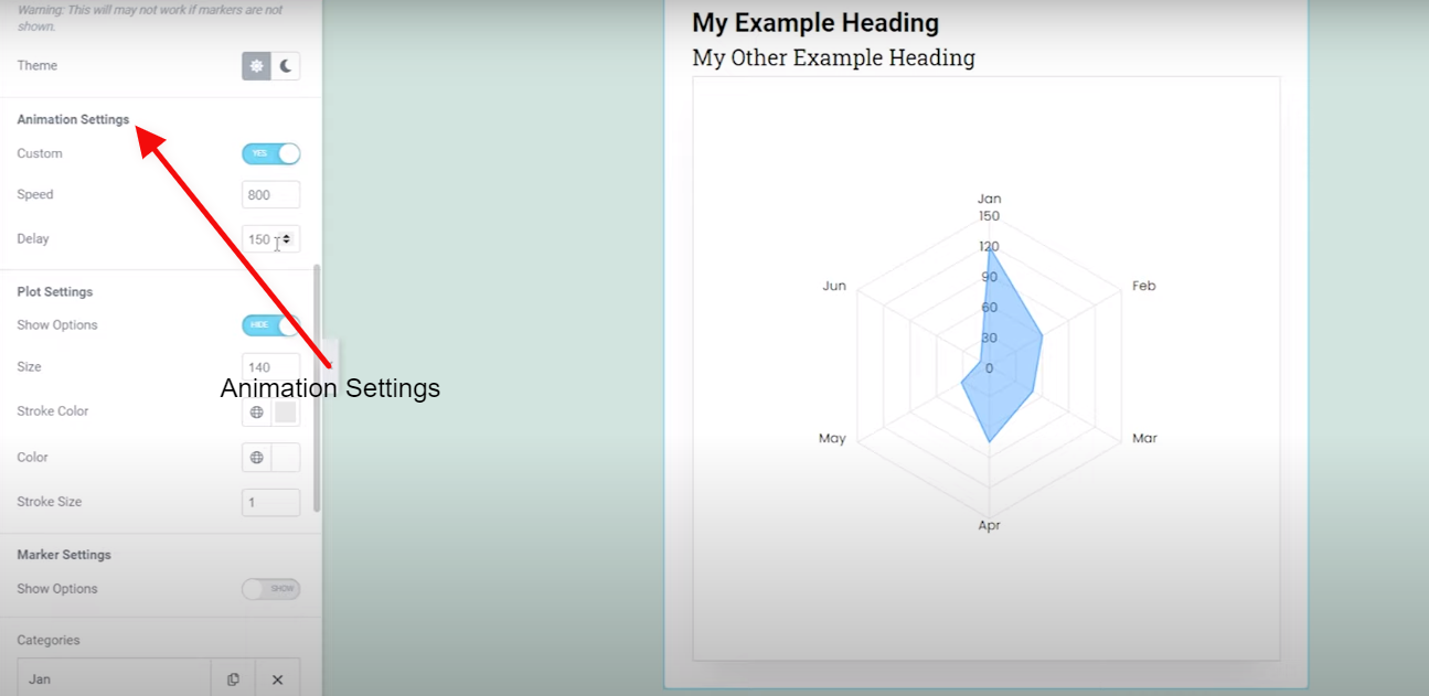
You can also add the Animation by clicking on the Animation settings.
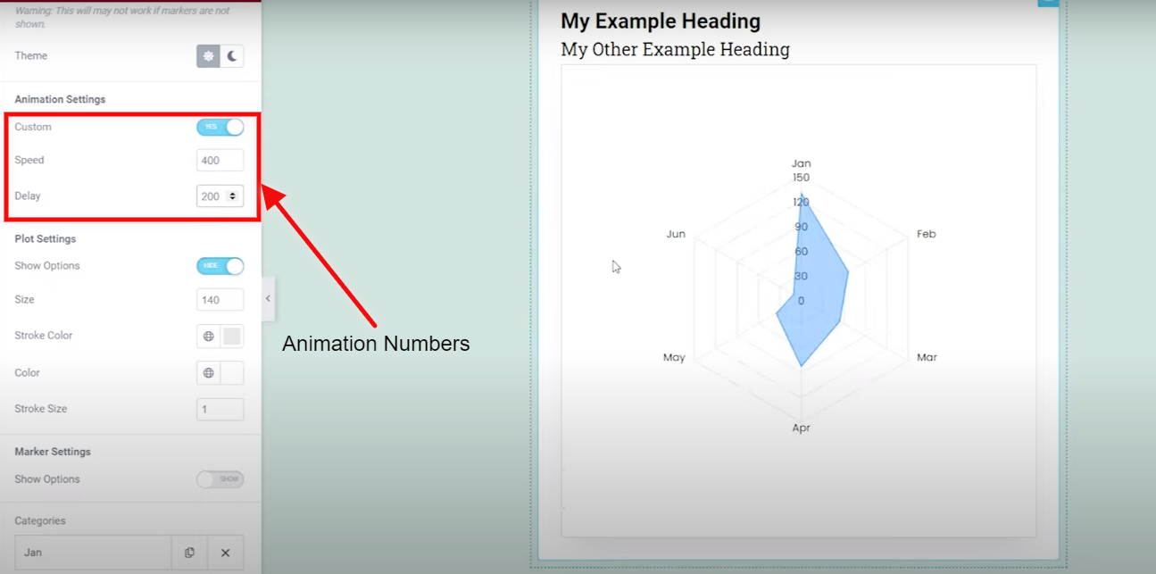
You can also add the speed and delay of Animation by adjusting their numbers.
In elements, you can add value to the elements by clicking on Element 1.
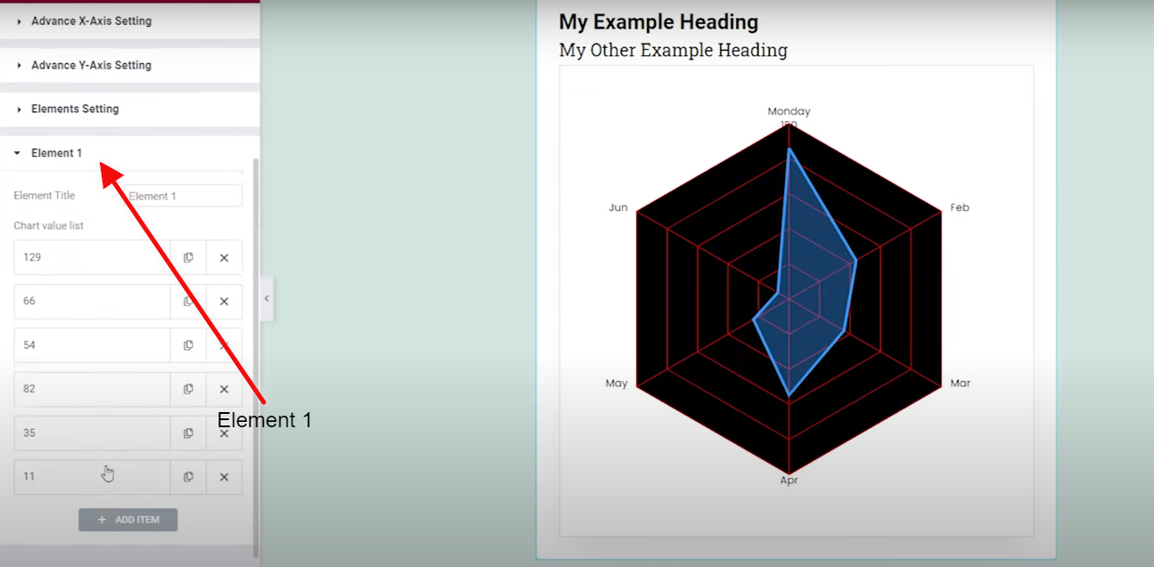
Now your whole customized Chart is complete and now just add your data and you will see the results in your Radar Chart or Spider Chart.
And for sure I know! how mesmerizing the whole radar chart looks after putting data into it. Try it by yourself and give us your feedback on it.
Was this article helpful?
YesNo


