
5 Ways To Take Your Line Chart To Next Level With Graphina Pro
ByJasmin M
566 Views
Data visualization is the backbone of any organization – irrespective of size and scale of operation. From market surveys for a product to sales statistics, entrepreneurs and decision-makers rely heavily on data to make a well-informed and data-backed future action plan.
As so much information is available at our fingertips, organizing the data in an analyzable and actionable way makes all the difference and that’s when Line charts come in front. Of all other data visualization line charts are one of the simplest yet highly significant forms of data visualization for decision-makers.
Graphina Pro – Elementor Dynamic Charts Graphs and Datatables plugin is a brilliant way of getting along with the latest data visualization business trend. With all the business-related charts and graphs, the best data visualization WordPress plugin ensures you stay ahead of representing data in the most aesthetically appealing way.
A line chart is used in business analytics and sales and performance metrics reporting. The structure of this chart is simple. Consisting of two variables plotted along the axes with the adjacent points joined by line segments, line charts are a great way of graphically representing data. They are widely popular for showing time series on the x-axis, this type of chart is simple to understand and use.
Understanding Line Charts in Business
There are variations in Line charts and you can use variations to optimize your data visualization optimally. The variations on the line graph include charts in time series – by joining line charts of historical data with ranges of future projections.
This kind of variation is used in forecasting sales and demand for the product/service. There is another common variation to line charts – plotting the linear regression or in simpler terms – the trend line between the two variables; superimposing it on the line graph to find the current trend.
The slope or skewness of this chart shows the rate of change at that particular point and highlights areas of discontinuity or irregular change between two variables.
This usually happens when a sales trend is being plotted on the line graph and the irregular changes in sales could mean that the promotional campaign you ran worked and increased the sales.
Types Of Line Charts In Business
There are different types of Line charts businesses use depending on the industry and datasets they have. The Line chart is one of the simplest and most commonly used formats of data visualization for years, we show you different types of line charts you can add to your web pages using Graphina – Elementor Dynamic Charts Graphs and Datatable plugin.
Simple Line chart
The most recognizable Line chart comes with ease of readability. Showing trends over some time or showing progress or change in different categories, Line charts work best when your data set is continuous rather than short-term.
Line charts with Markers
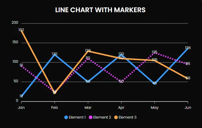
Line charts can be made more powerful and efficient with Markers. Using the Markers in the chart will highlight data points from the dataset you’ve used in the chart. Graphina Pro – Elementor Dynamic Charts Graphs and Datatables also allow users to customize the Markers.
Stacked Line chart
Stacked Line charts are perfect for considering cumulative Sales data of various segments. This type of chart comes with multiple lines of data points but will not overlap as they will be cumulative at each point.
Stacked Line chart with Markers

Adding markers is a brilliant way of adding the data to make crystal clear decisions. For better data visualization of data points on the chart, use this Stacked Line with Markers type of chart.
100% Stacked Line chart with Markers
Plotting a 100% stacked Line chart with markers comes with clarity and insight for the decision-maker. Cumulative data is shown to spot the trend of the product over some time. You can even add a 100% stacked line chart without highlighting any data points with markers.
Adding A Line Chart To Your Web Page With Elementor Page Builder
With the world’s best page builder Elementor, Graphina Pro is taking data visualization to the next level. The magnificent potential of this Elementor Dynamic Charts Graphs and Datatables plugin empowers WordPress site owners to add, edit, and embed dynamic charts and graphs into their Elementor web pages with just a few clicks.
The Best data visualization WordPress plugin comes with a set of Apex charts and a Google charts library that is built for all working with Elementor sites.
See Live Demo of Elementor Dynamic Charts Graphs and Datatables
Read Elementor Dynamic Charts Graphs and Datatables
Adding A Line Chart To your Web Page With Divi Page Builder
Graphina Pro – Elementor Dynamic Charts Graphs and Datatables plugin are now available for Divi users. As Divi comes with tons of customization options, the page builder is quickly gaining popularity among WordPress site owners. To make dynamic Charts and Graphs in Divi more than just possible and fun but also highly user-friendly, Graphina Pro – Divi Dynamic Charts & Graphs plugin is ready to take over all your data visualization dilemmas in just a few clicks.
See Live Demo of Divi Dynamic Charts and Graphs
Read Divi Charts and Graphs documentation
Conclusion:
Data visualization has the power to convert tons of data into meaningful chunks of information. There are tools to craft various data visualization formats and Graphina Pro – Elementor Dynamic Charts Graphs and Datatables plugin is a powerhouse of all the modern and industry-specific niche charts and graphs that can be made dynamic for your dataset in just a few clicks. Without any analytical expertise or skills, you can work with the most powerful Elementor charts plugin effortlessly.
Try Graphina Pro today or download the free version and start your data visualization to your advantage. Have questions on how to use the free version of Graphina – Free Elementor Charts and Graphs plugin? Take a look at our detailed documentation or a short Graphina and data visualization course available on our Youtube channel. Read all the resources of Graphina here – Graphina | Iqonic Design
Was this article helpful?
YesNo


